Click the link here to view a presentation on the choices of magazine i used for inspiration when conduction my production. http://prezi.com/fwxbles9gsuf/edit/#28
I completed four content analysis of different music magazines. Three were the front covers alone and one was the whole magazine. They were on Mix mag, kerrang and two of NME.

 I carried out two of NME because i wanted my magazine to be based around this magazine in many aspects. So by doing and in depth analysis and one of the cover, i was able to see what styles and features were on the same on and within the magazine. I done an analysis of Mix Mag because, although it is a dance magazine, i wanted to see what they used on their cover to make it very popular and if there was anything there i could use to the same effect on my production. Here is a link to NME's website, this helped me a lot with my production.
I completed four content analysis of different music magazines. Three were the front covers alone and one was the whole magazine. They were on Mix mag, kerrang and two of NME.

 I carried out two of NME because i wanted my magazine to be based around this magazine in many aspects. So by doing and in depth analysis and one of the cover, i was able to see what styles and features were on the same on and within the magazine. I done an analysis of Mix Mag because, although it is a dance magazine, i wanted to see what they used on their cover to make it very popular and if there was anything there i could use to the same effect on my production. Here is a link to NME's website, this helped me a lot with my production.
http://www.nme.com/home
 For my front cover, i took the usual three way split. Where the cover is split into the equal sections from the top of the page to the bottom, here i placed my cover model in the centre of the three sections to show that he is the main focus. On some other covers that i have analysed, like kerrang, they had a cover of ‘100 greatest riffs’. They placed this writing on the centre of the page, they then had two musicians standing either side taking full advantage of the space on the cover. Although it isn’t a very common thing to do with a cover, with certain genres of magazine it works as is the case with this one.
 For my front cover, i took the usual three way split. Where the cover is split into the equal sections from the top of the page to the bottom, here i placed my cover model in the centre of the three sections to show that he is the main focus. On some other covers that i have analysed, like kerrang, they had a cover of ‘100 greatest riffs’. They placed this writing on the centre of the page, they then had two musicians standing either side taking full advantage of the space on the cover. Although it isn’t a very common thing to do with a cover, with certain genres of magazine it works as is the case with this one.
Click here to view the website for kerrang, this magazine also helped me with my production.
http://www.kerrang.com/
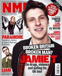
In comparison to some covers by NME, an issue with Jamie T on the front (shown here), they use him, similar to the way i have used mine, and placed him in the centre section in front of the masthead showing his importance. NME then have two inset pictures on the left hand side and a small amount of writing on the right, above where the models body takes up the rest of the cover. These two magazines, Kerrang and NME, are the ones which i based my production around.

The contents page i based around kerrang’s style, i have done this because i liked the way it was constructed and designed. It had a good form to it, it was bold and interesting. The page itself was divided into two, top and bottom. In contrast to NME who do not actually have a contents page, they have a strip with all the bands mentioned in the magazine and where they can be found on what page. However, for the article, i took a similar approach to way NME had constructed and designed one of theirs. They took up a full page with with a photo along with a title across the bottom, they then began the article itself on the next page. I felt this was a good design as it was a warming photo also in black and white, as well as the writing which was layed out in a professional way but interesting at the same time.
 Another cultural and media influence was a trip to IPC. This was especially helpful as we were given tips on what we could do to improve our covers even further, to make them look more professional and to also get us a higher grade. On some covers, we were told to move or create certain objects in the ‘hotspots’ area so that when magazines are stacked in shops people are able to see parts of the cover which will attract their attention.
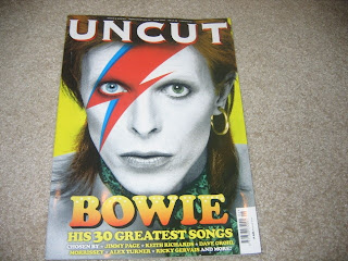
We were also given tips from the editor of uncut, as my cover is in black and white, the same as many of theirs, i was given many useful tips on how make a cover in black and white stand out more and be even more noticeable, like they did with the cover of their magazine featuring David Bowie. http://www.uncut.co.uk/
2. When thinking of the image for my front cover, I wanted to represent different people to show that my magazine wasn’t just aimed at one type of person. Therefore the representation within my magazine is aimed at a small variety of people, of the same age range. For example, the magazine is aimed mainly at those who love indie music but at the same time may appeal to those who listen to r’n’b and hip hop.
My media product represents a particular social group just from the front cover. I have placed a male singer on the cover, on his own, as I feel that there is less focus on lone musicians in comparison to bands.
The target audience for my magazine is about 18-21, this age range is where people show their independance as most are taking life changing steps, either going to university or into full time employment. By him having his shirt slightly undone and his tie just hanging around his neck shows that he is cool, calm and collected which is what most people aim to be at this age. Experiencing new things for the first time, people try and impress, which is common at this age.
The representation that would come across from the people i have used in my magazine would be someone typically slim, white and stylish.

By choosing to have this as my cover image, it could easily portray to people that to be like this person they must be slim, they must be male and most importantly be white. This is typically a form of stereotype, which is what i have tried to subvert, however it is clear by the cover model that he is everything which that stereotype talks about. By placing the image on my cover in black and white, you are still able to tell what colour of skin they have, therefore making it neither aimed at people who are black or white. I have also tried to subvert the typical stereotype that people who dress a certain way or have a certain type of hair style listen to a particular type of music, and nothing else but that genre. By placing a model, who has a typically indie styled hair cut, on the cover of a magazine which features various genres of music, it subverts that typical stereotype that people of a typical lifestyle listen to different types of music, not just indie and rock. By having one person on the front, portrayed as a lone singer, it shows his independence which someone of the same age could also be seen as. At that age of people making big changes and it would give them something to relate to.

The type of magazine I have produced is something that is majority indie style music but has various elements of r’n’b, rap, rock type genres too. Although this may help appeal to a wider audience, those who are big indie listeners may lose taste in the magazine if it appeals too much to a genre which it isn’t based firmly on. Magazines like NME which also include elements of different genres, have to be aware of how much they put in, by constantly placing rap of r’n’b music within the magazine common buyers may lose interest and resort to buying something different.
The sense of reality i have constructed is shown, mainly, by the cover. The title linking with the cover ‘born into the music business’ could show the most reality, because of the cover models age he looks quite young but mature. Which is why the title works well, as like michael jackson who had to grow up very quickly from a young age, with the image as he looks like someone who is very adult for his age.
The way my cover model is represented is as a romantic type of person, with a nice smile and a twinkle in his eye, the kind of person who women dream of being their husband. He is in a way a stereotypical ‘handsome’ man. The way he is positioned could possibly show him serenading someone with his guitar, in a romantic location. With his shirt unbuttoned and tie hanging by around his neck, he shows the profile of someone professional. He is shown to also be some what of a prodigy and someone to watch out for in coming years.
 3. The task fits into professional practise as my production took me through various roles which are key to the production and publishing of a real magazine at somewhere like EMAP.
The kind of institution that would distribute my media product would be a company similar to EMAP. This is because it is very similar to other magazines like NME and Kerrang.
My magazine would be sold by a big publishing group because of its features like the music it talks about and the way it is similar to other big magazines produced by IPC. The audience which my magazine appeals to is the same as kerrang and NME. It contains similar features, my magazine contains aspects of different genres of music but bases around indie. I would choose to be distributed by EMAP as IPC would obviously not want to publish and sell a magazine very similar to their own, it would therefore give them some competition.

In comparison to some covers by NME, an issue with Jamie T on the front (shown here), they use him, similar to the way i have used mine, and placed him in the centre section in front of the masthead showing his importance. NME then have two inset pictures on the left hand side and a small amount of writing on the right, above where the models body takes up the rest of the cover. These two magazines, Kerrang and NME, are the ones which i based my production around.

The contents page i based around kerrang’s style, i have done this because i liked the way it was constructed and designed. It had a good form to it, it was bold and interesting. The page itself was divided into two, top and bottom. In contrast to NME who do not actually have a contents page, they have a strip with all the bands mentioned in the magazine and where they can be found on what page. However, for the article, i took a similar approach to way NME had constructed and designed one of theirs. They took up a full page with with a photo along with a title across the bottom, they then began the article itself on the next page. I felt this was a good design as it was a warming photo also in black and white, as well as the writing which was layed out in a professional way but interesting at the same time.
 Another cultural and media influence was a trip to IPC. This was especially helpful as we were given tips on what we could do to improve our covers even further, to make them look more professional and to also get us a higher grade. On some covers, we were told to move or create certain objects in the ‘hotspots’ area so that when magazines are stacked in shops people are able to see parts of the cover which will attract their attention.
We were also given tips from the editor of uncut, as my cover is in black and white, the same as many of theirs, i was given many useful tips on how make a cover in black and white stand out more and be even more noticeable, like they did with the cover of their magazine featuring David Bowie. http://www.uncut.co.uk/
2. When thinking of the image for my front cover, I wanted to represent different people to show that my magazine wasn’t just aimed at one type of person. Therefore the representation within my magazine is aimed at a small variety of people, of the same age range. For example, the magazine is aimed mainly at those who love indie music but at the same time may appeal to those who listen to r’n’b and hip hop.
My media product represents a particular social group just from the front cover. I have placed a male singer on the cover, on his own, as I feel that there is less focus on lone musicians in comparison to bands.
The target audience for my magazine is about 18-21, this age range is where people show their independance as most are taking life changing steps, either going to university or into full time employment. By him having his shirt slightly undone and his tie just hanging around his neck shows that he is cool, calm and collected which is what most people aim to be at this age. Experiencing new things for the first time, people try and impress, which is common at this age.
The representation that would come across from the people i have used in my magazine would be someone typically slim, white and stylish.

By choosing to have this as my cover image, it could easily portray to people that to be like this person they must be slim, they must be male and most importantly be white. This is typically a form of stereotype, which is what i have tried to subvert, however it is clear by the cover model that he is everything which that stereotype talks about. By placing the image on my cover in black and white, you are still able to tell what colour of skin they have, therefore making it neither aimed at people who are black or white. I have also tried to subvert the typical stereotype that people who dress a certain way or have a certain type of hair style listen to a particular type of music, and nothing else but that genre. By placing a model, who has a typically indie styled hair cut, on the cover of a magazine which features various genres of music, it subverts that typical stereotype that people of a typical lifestyle listen to different types of music, not just indie and rock. By having one person on the front, portrayed as a lone singer, it shows his independence which someone of the same age could also be seen as. At that age of people making big changes and it would give them something to relate to.

The type of magazine I have produced is something that is majority indie style music but has various elements of r’n’b, rap, rock type genres too. Although this may help appeal to a wider audience, those who are big indie listeners may lose taste in the magazine if it appeals too much to a genre which it isn’t based firmly on. Magazines like NME which also include elements of different genres, have to be aware of how much they put in, by constantly placing rap of r’n’b music within the magazine common buyers may lose interest and resort to buying something different.
The sense of reality i have constructed is shown, mainly, by the cover. The title linking with the cover ‘born into the music business’ could show the most reality, because of the cover models age he looks quite young but mature. Which is why the title works well, as like michael jackson who had to grow up very quickly from a young age, with the image as he looks like someone who is very adult for his age.
The way my cover model is represented is as a romantic type of person, with a nice smile and a twinkle in his eye, the kind of person who women dream of being their husband. He is in a way a stereotypical ‘handsome’ man. The way he is positioned could possibly show him serenading someone with his guitar, in a romantic location. With his shirt unbuttoned and tie hanging by around his neck, he shows the profile of someone professional. He is shown to also be some what of a prodigy and someone to watch out for in coming years.
 3. The task fits into professional practise as my production took me through various roles which are key to the production and publishing of a real magazine at somewhere like EMAP.
The kind of institution that would distribute my media product would be a company similar to EMAP. This is because it is very similar to other magazines like NME and Kerrang.
My magazine would be sold by a big publishing group because of its features like the music it talks about and the way it is similar to other big magazines produced by IPC.
 The audience which my magazine appeals to is the same as kerrang and NME. It contains similar features, my magazine contains aspects of different genres of music but bases around indie. I would choose to be distributed by EMAP as IPC would obviously not want to publish and sell a magazine very similar to their own, it would therefore give them some competition.
With my magazine, there are various oppertunities for convergence. As my magazine is called mercury, there could be an oppertunity to connect with the mercury awards and become the established magazine for that award ceremony. Just like NME, there is also the chance to produce Mercury TV as well as a radio station where top music can be played. I would also consider the chance phone wallpapers and posters. The biggest convergence which i would aim for would be a website, here i could post the latest news of the company, past issues, have a link to the radio station, watch video clips and many more others. A negative point though, is that i havent included any reference to this within my magazine.
Click the link to view a presentation i created to show the opportunities my magazine has for convergence. http://prezi.com/bnlnqbwzmuvk/edit/
4. The audience research i conducted turned out to be very similar to what i had firstly predicted. I sent out a survey to various people and conducted several outside different music clubs. This was to get a different view on each answer. The answers i received helped me produce a clear cut idea of my demographics and psychographics. They showed me that the majority of people that would read my magazine would be about 20 or 21, which is some of target audience for my magazine, i aimed to appeal to 18-21 year olds. People that would by the magazine would prefer it to be weekly therefore making it a bit cheaper, around £2.20-£2.60. They would prefer it to be weekly also as it is a better source of entertainment for the week and it gives them something to look forward to at the end, in comparison to a monthly magazine which is more expensive, less easy to carry around and can be read quite quickly leaving oppertunity for people to go and find entertainment in the way of another magazine.
Here is a piece of audience research i conducted into my finished media product.
This is the magazine which i
based my magazine around.
5. The USP of my magazine is that it covers a variety of genres instead of being based solely around one type in particular. My magazine covers r’n’b, indie, rock, alternative and some rap, however focusing mainly on the indie genre. It therefore appeals to a wider audience. I would market it using several different advertisements to promote the launch of the magazine, in the advert I would also state that there is also radio, website, TV and mobile downloads with the brand. After that I would leave it partly to word of mouth. With radio broadcasts and the website I would not use another advert for some time apart from ones based on other music channels. Instead, I would make it clear that the magazines was weekly, how much it is and where it could be purchased.
For the front page I used the typical colours for a music magazine which are black, red, white and occasionally yellow. Because I had used a black and white image on my cover, I decided to use red for the masthead as I knew this would be the colour which would stand out most and catch the eye of readers. I placed the masthead in the typical top left hand corner of the page, so that if magazines were stacked in the typical way, the red on black contrast would really stand out well.
As well, as the image being in black and white, it is different to see something like this being released unless it was a special edition. If the magazine was to be placed among others, which were full of vibrant colours, fonts and pictures etc then mine would be more noticeable because of the way the red and yellow contrasts with the black and white.
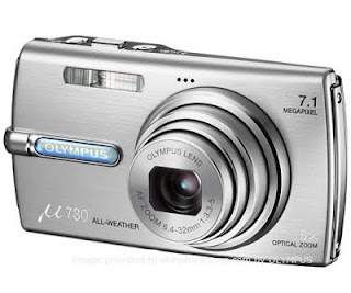
6. From the beginning of the production, I have learnt to use a vast amount of new technology some of which I had never come into contact with before. I have learnt a lot from camera styles and settings to the use of lighting and different publications on apple macs. These features have helped me to produce a piece of work which I am very proud of.
For the front page I used the typical colours for a music magazine which are black, red, white and occasionally yellow. Because I had used a black and white image on my cover, I decided to use red for the masthead as I knew this would be the colour which would stand out most and catch the eye of readers. I placed the masthead in the typical top left hand corner of the page, so that if magazines were stacked in the typical way, the red on black contrast would really stand out well.
As well, as the image being in black and white, it is different to see something like this being released unless it was a special edition. If the magazine was to be placed among others, which were full of vibrant colours, fonts and pictures etc then mine would be more noticeable because of the way the red and yellow contrasts with the black and white.

6. From the beginning of the production, I have learnt to use a vast amount of new technology some of which I had never come into contact with before. I have learnt a lot from camera styles and settings to the use of lighting and different publications on apple macs. These features have helped me to produce a piece of work which I am very proud of.
One new piece of technology i
learned how to use within
the production.
These tools helped me in many ways. By using different components on photoshop I was able to change certain features on photos which I had taken to be placed within my magazine. From the start, using a digital camera, although I have used them before, I had learned how to use different effects on the camera itself. How to take a photo in black and white, sepia, a dark surrounding, snowy settings etc. This helped me to see what effect I would need to use when taking my photo, as I had planned from the beginning I wanted to take the photo in black and white and by learning these features I was able to produce 15 really good photos for my cover.
 I haven’t yet mastered how to use photo shop properly, there are a lot of effects which I am eager to learn. They could help transform my production from a good magazine to a brilliant one. I haven’t yet mastered many programs on the apple mac itself, I would like to learn how to use these programs as they may help me when it comes to producing other pieces of work. If I had learnt how to use these different features, I may have been able to produce a better piece of work because some of the effects on photo shop and a mac, can make certain parts of a magazine look more professional than others. For example, using crop tools to change the size of the photo, if I hadnt used this tool then the image on both my cover and article would have been an odd size and not fitted with the page size.
7. Looking back at my preliminary task and my current production task together, i would say that i could have definitely used my time more efficiently. When it came to taking my photos i didnt use time well, instead i waited until it was getting too late to take them as days went by. Which made it harder to actually get a model to use for the cover. When i finally got round to taking the photo, i was very pleased with the result. The equipment on the other hand i managed very well, the digital camera and tripod i used i put to good use. I come to terms with using different effects on the camera itself, this was so that i got the best picture possible. One problem solving decision i had to overcome was coming to terms with using apple macs and the dtp. I had never used one of these before so it took me a while to come to terms with them and progress on using different features of the macs. I had to progress with the new technology along with the development of my ideas, from thinking of basic ideas and themes for my production to adding in different effects which i was allowed access to on these computers.


